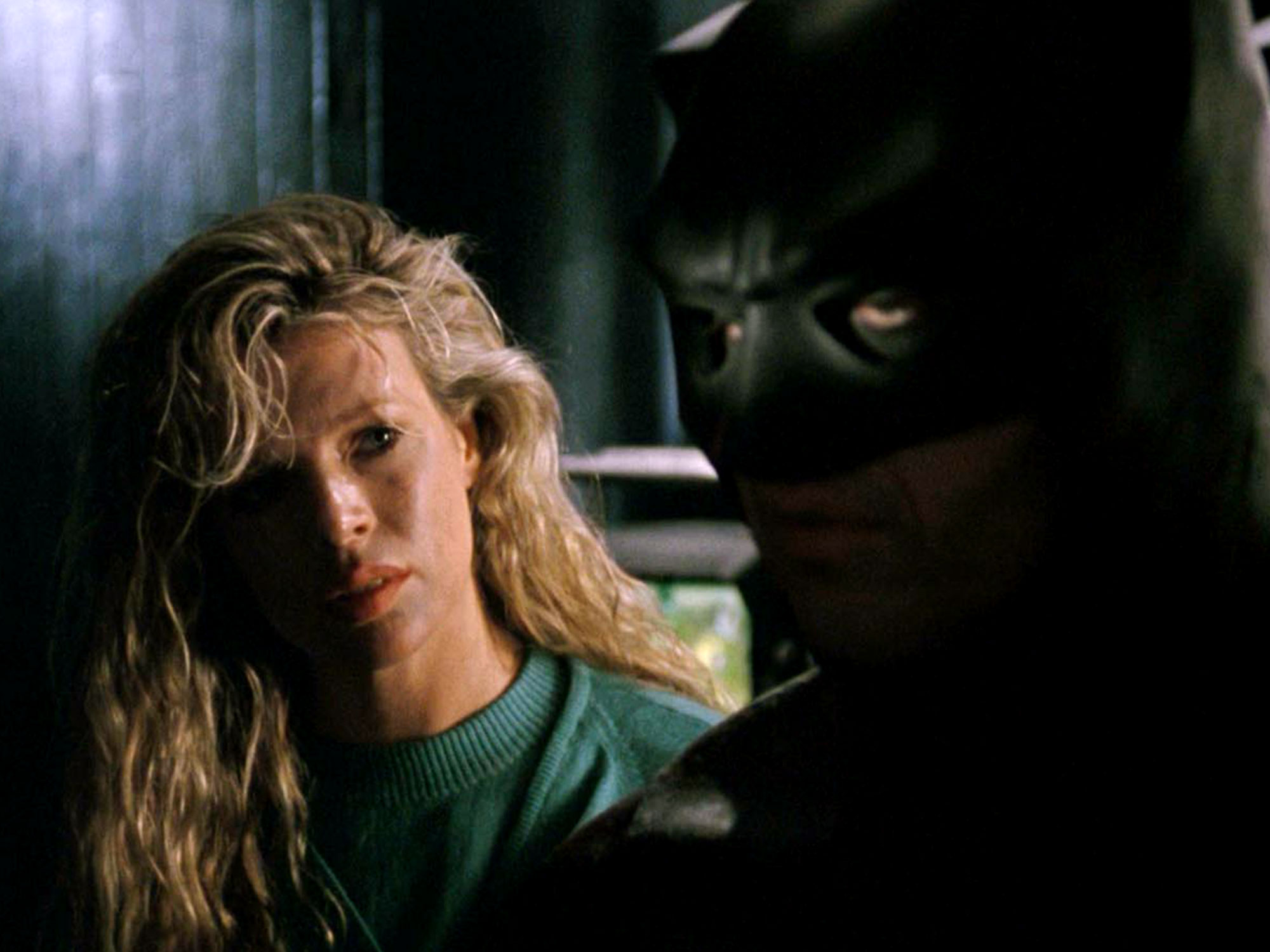
In the 30 years since the release of Tim Burton’s Batman, there have been a number of different iterations of the Dark Knight on screen, from Christopher Nolan’s crime epics to Joel Schumacher’s camp, neon-soaked nightmares. Yet even now Burton’s vision of Batman remains the most distinctive, the director having marked a seismic shift in Hollywood filmmaking while remaining true to his gothic weirdo charm.
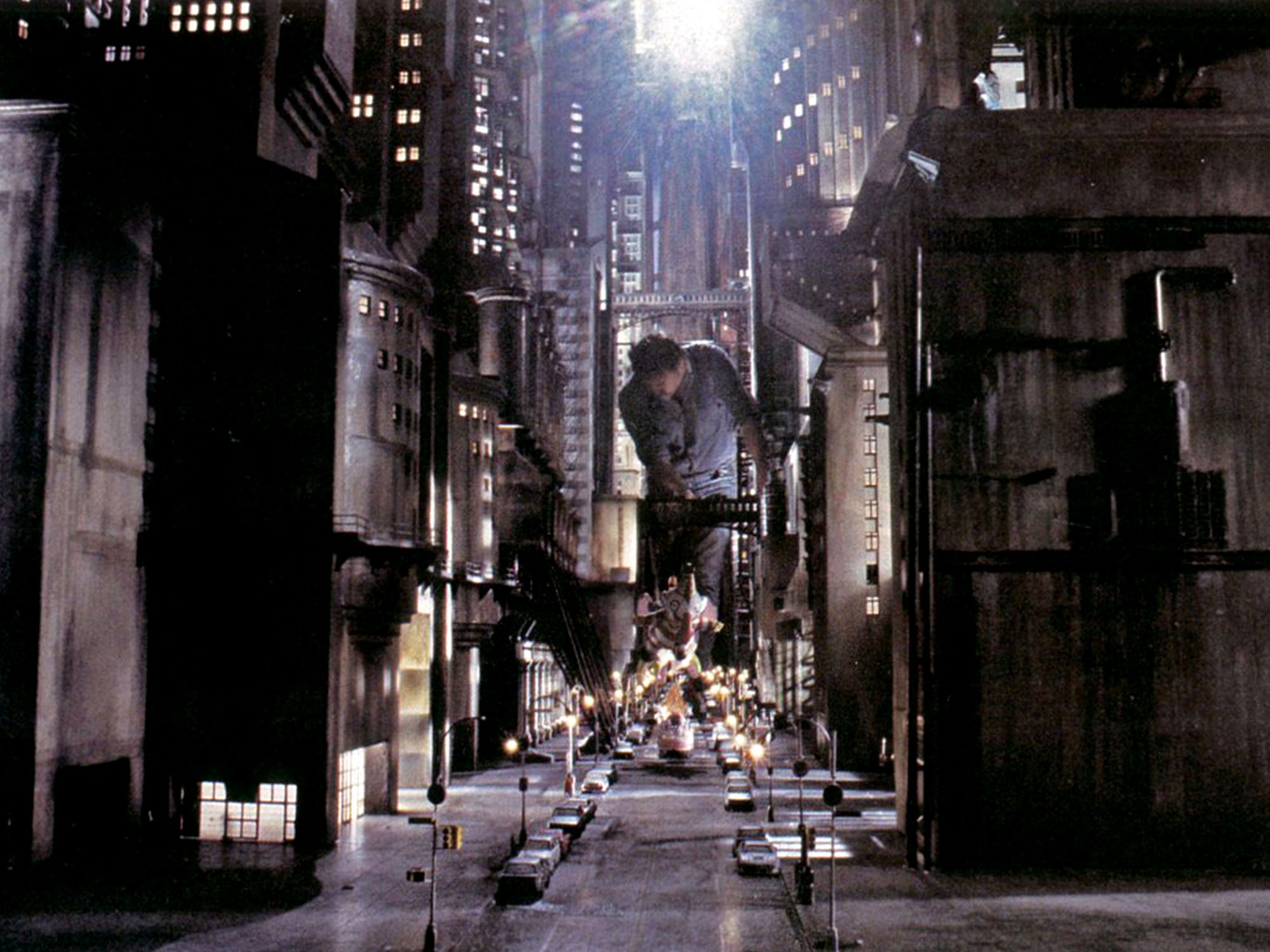
Though marketed by Warner Bros as a world-changing event on its release, the film begins with remarkably little fanfare compared to what you’d expect from a superhero film today. It’s immediately a more sombre affair, opening with a montage of close ups of twisted stone arches that are eventually revealed to be the Batman logo – all set to Danny Elfman’s excellent score. After the opening credits, the first image we see is the Gotham City skyline, a shadowy cluster of imposing spires reaching towards the heavens. But the film shies away from high-flying action, shifting the action to the streets below. Despite his reservations about the film Roger Ebert called Burton’s Gotham one of cinema’s greatest creations, and it’s not hard to see why.
Working with Anton Furst, who won the Oscar for Art Direction for his contribution to the film, Burton’s Gotham wears its influences on its sleeve. It’s a nightmarish, Frankenstein’s monster of a city comprised of a mishmash of clashing visual influences, with gothic expressionism meeting the style of 1920s Art Deco New York and even the wild dystopia of Terry Gilliam’s Brazil. Twisting pipes and strange, angular interiors right out of The Cabinet of Dr Caligari, clash with gargantuan stone arches; the Gotham City Town Hall is an imposing monolith that could easily fit into the surroundings of Fritz Lang’s Metropolis.

The characters who inhabit the film themselves look out of time, many of those we meet look and talk like they’ve been plucked right out of a ’40s Hollywood drama. It’s exactly the kind of city that would need defending by a lunatic in a rubber bat costume – with completely anarchic city planning to match the streets lying below its haphazard web of skyscrapers. This image of Gotham was so striking that Bruce Timm and Paul Dini’s Batman: The Animated Series ran with it, (even inheriting the film’s design of the Batmobile and Elfman’s theme) when it began airing in 1992, and found great success itself for this. Even Bob Kane, who created Batman 80 years ago, said that when he pictured Gotham, he pictured the version that Burton created.
It’s a sharp contrast to the superhero films that have now become a Hollywood norm. Though cosmic wackiness and camp has to an extent found its way back into the genre (we did see a sincere Aquaman movie and a talking raccoon hold a prominent role in this year’s biggest blockbuster, after all), with the exception of a certain animated multiversal superhero movie there’s a concerning lack of innovation when it comes to world building or visual expression.
In the case of the Marvel Cinematic Universe, Kevin Fiege and co have built a complex machine that emulates the storytelling structure and editorial priorities of mainstream superhero comics – but it often feels like it’s missing a vital piece. Comic books are defined by their art as much as their writing; the best ones can speak volumes through their pencilling and colouring alone (one such example can be found in David Aja and Matt Hollingsworth’s work with writer Matt Fraction on Hawkeye). While Marvel Studios has loosened its grip in some instances, the constant puzzle piecing of the franchise hasn’t allowed all that much room for experimentation – at least nothing as out there as Batman or Batman Returns (although Spider-Man: Into The Spider-Verse manages this and more).
The characters of these films exist in isolation – even the Thor movies feel detached from Asgard and its inhabitants, restricted to the palace, a portal and little else. Both Burton’s Gotham and Wakanda benefit from a dedication to world building and a sense of place, creating some familiarity with the location the heroes are meant to be protecting. The New York City of Sam Raimi’s Spider-Man, Wakanda, Burton and Furst’s Gotham – all have a distinctive tone. For the most part, the members of the Avengers aren’t really anchored to anywhere, they’re globetrotting movies to the point where even your friendly neighbourhood Spider-Man from Queens is going abroad for his next adventure.
As the MCU established its template for superhero blockbusters, there has been a tendency of its films to all meet in the middle visually. While it’s unclear how much say the directors have had in translating their visual style into these adaptations, the palette is often dominated by greys and mild oranges and blues. There are exceptions: Joe Johnston’s Captain America: The First Avenger leans into a ’40s adventure serial vibe, James Gunn’s Guardians of the Galaxy embraces Marvel’s potential for cosmic weirdness. The visualisation of Wakanda, the technologically advanced afrofuturist paradise of Ryan Coogler’s Black Panther is the closest any of Marvel Studio’s efforts have come to matching Burton’s loopy vision of Gotham, heavily drawing on cinematic influences to build worlds that feel unique to the characters that inhabit them.
It doesn’t help that Marvel Studio’s more outlandish visions are mostly constructed digitally (to be fair, a lot of this is out of necessity), the pre-vis nature that dominates both the action sequences and their visual world-building adds a sense of intangibility that’s hard to shake. Burton and Furst’s use of charcoal backgrounds and miniatures and dedication to exploring the city at street level may seem rudimentary, but this gave their films a texture that often escapes other superhero movies – and it existed almost entirely on a Pinewood Studios backlot.

Modern superhero films (and in fairness, Burton himself, considering his recent track record) could stand to adopt more of the ethos of Furst’s production design on Batman and Bo Welch’s subsequent work on Batman Returns, which embraced the sort of intense, fantastical stylisation found in comic books. The most exciting and memorable superhero movies have leant into the goofy, pulpy stylisation that Burton and Furst and later Sam Raimi lead with. It would be nice if, instead of the self-referencing that we’ve become used to from the MCU, the studio looked outward, using cinematic history other than their own as building blocks.
Perhaps now that Marvel’s burden of building ‘The Infinity Saga’ is over, there will be more room to experiment – and there are few examples better to follow than the one that Burton set. It’s the feeling and texture of Gotham that people still talk about the most in relation to Batman, even more so than Jack Nicholson’s performance. Its mood and atmosphere has endured more than the story, which is where the focus of modern superhero films seems to have shifted, at the expense of the exciting visuals that are so intrinsically important to the best superhero comics.
The post Hollywood could still learn a thing or two from Tim Burton’s Batman appeared first on Little White Lies.
![Forest Essentials [CPV] WW](https://s3-us-west-2.amazonaws.com/pcw-uploads/logos/forest-essentials-promo-codes-coupons.png)
0 comments