Illustrator Spends A Full Year Recreating The Zodiac As Goddesses, And The Result Is Amazing
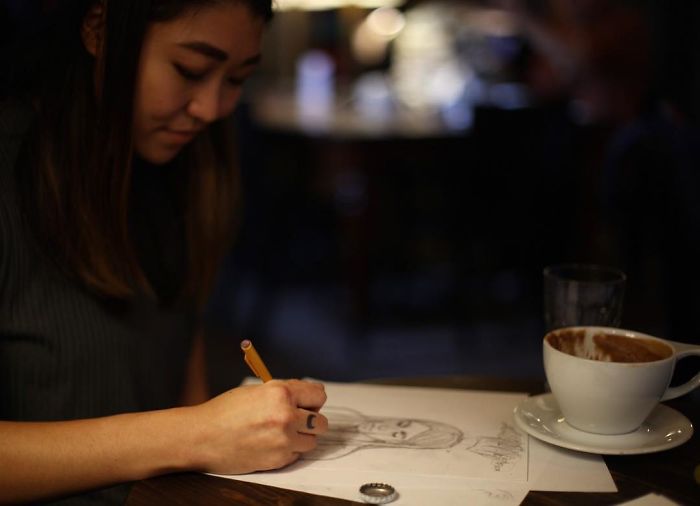
You don’t need to believe in the stars to really appreciate these zodiac illustrations by Emilee Petersmark. A band called The Accidentals approached her with this project in 2017, asking Emilee to create 12 posters based on the zodiac over the course of a year. She reimagined all of the signs as mythical goddesses, and the images are so good, people think she should create a tarot deck.
“It’s crazy to look back at the first one and see how much my skills have improved with a year of consistent practice,” Petersmark told BuzzFeed. “To be honest, before this project I was only vaguely familiar with the zodiac. However, this project really got me to appreciate the mythos behind each astrological sign.”
“I love how connected some people feel to their signs — and by extension, to artistic interpretations of their signs. I really wanted to make something that felt special for those people. Beyond that, I was really excited to create a series that explored power and femininity in different ways.”
Scroll down to check the best astrological promotion campaign and tell us what you think about it in the comments!
More info: theaccidentalsmusic.com | Instagram
Aries
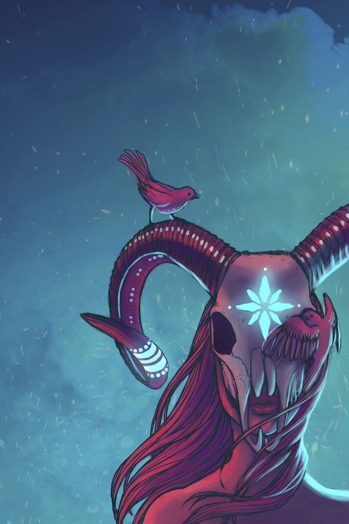
“This design was intended to be a grown-up version of Virgo — I wanted to portray a more mature version of the attitude in that poster. I also tried to give her a more wild, witch-like feel, taking the soft fall glow of Virgo and leveling it up with neon.”
Taurus
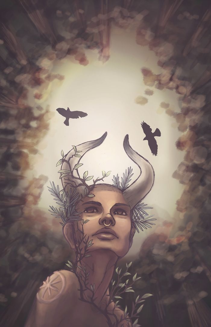
“This poster was super inspired by activist Emma González. I wanted Taurus to have a prominent sense of strength in the face of something ominous.”
Gemini
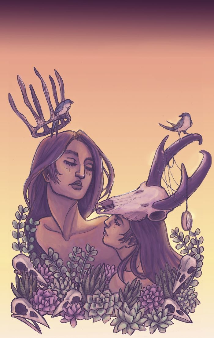
“The band was touring out west this month, so I went with a dusky desert theme. This one took some time to nail down, because I wanted the twins to seem subtly powerful, almost regal with their rustic crowns. It was important to me that none of the women in this series were overtly sexualized, but I wanted to keep some vulnerability and naturalness to this sign.”
Cancer
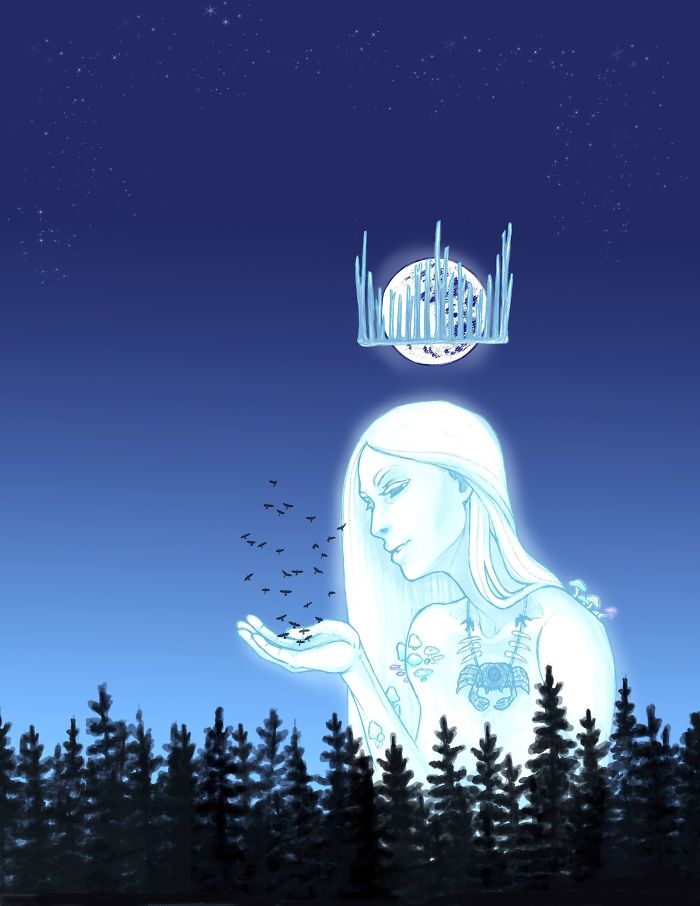
“This month, The Accidentals were playing Electric Forest. I’ve only been to EF once, but I remember loving all the glowing neon in the middle of the dark woods. I wanted to capture that feeling of finding something otherworldly in the vast wilderness in the middle of the night.”
Leo
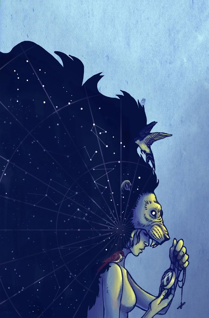
“This design was extra tricky, because it would also serve as part of The Accidentals’ album artwork. Their album is called Odyssey, and so I wanted this one to feel kind of like the beginning of a journey, with Leo being the heroine about to set off in search of something important. The band and I also collaborated heavily to create something that combined both natural, earthly elements and outer space.”
Virgo
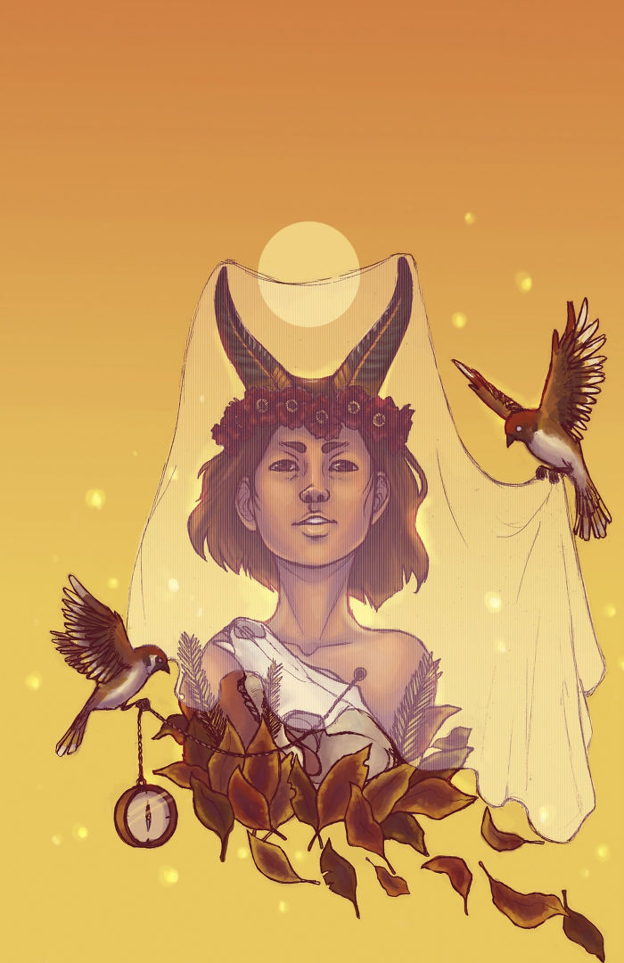
“Virgo is depicted as a virgin/maiden, so I tried to make the sign more youthful. My first attempt at this poster made the maiden look too timid, so I scrapped it in order to give her a little more attitude.”
Libra
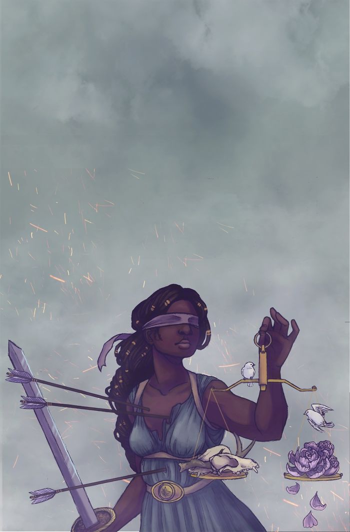
“I actually took this design from a Lady Justice sketch I did the day Trump was inaugurated. While I wouldn’t call this piece political by any means, drawing Lady Justice as a black woman was a conscious and pointed choice.”
Scorpio
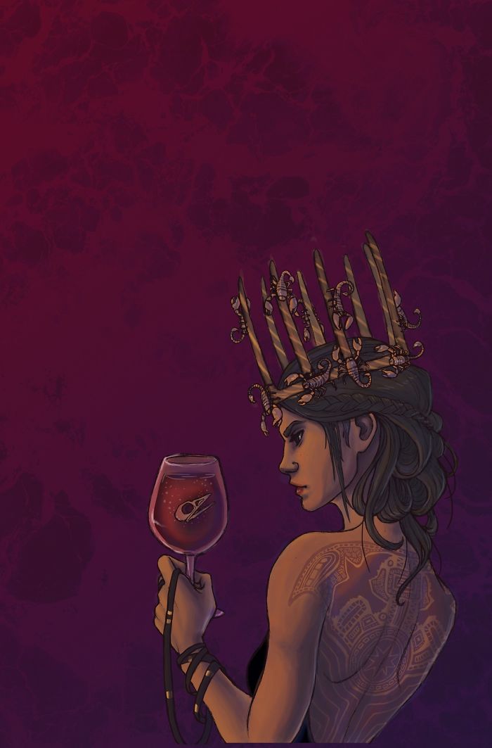
“I knew from the beginning I wanted one of the signs to be heavily tattooed, but it worked out so well to juxtapose the sleek, almost modern elements I’d wanted to associate with Scorpio with this traditional Polynesian-inspired tattoo.”
Sagittarius
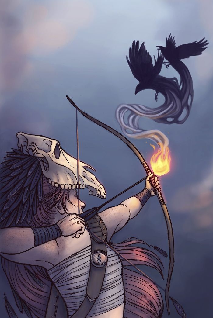
“I really wanted to think more outside the box with this one, but I realized that I couldn’t really portray an archer without a bow and arrow. I drew the line at drawing her as a centaur, though I did try to give a nod to the traditional representation of Sagittarius with the horse skull headdress she’s wearing. Throughout this series, I feel like I slowly became aware that it could use more diversity in body shapes, so I tried to give this sign a body type that was more functional to the lifestyle of someone who catches their own food and fights epic battles.”
Capricorn
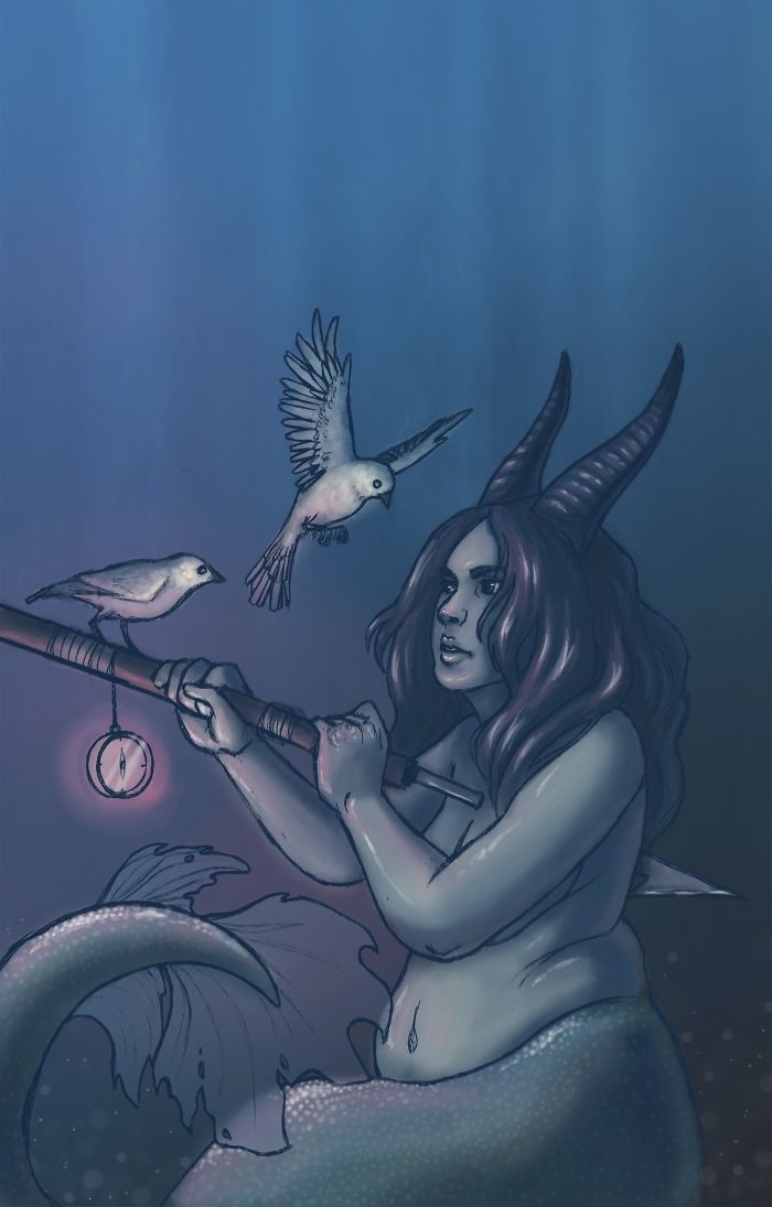
“The cool thing about this project was that it taught me quite a bit about the zodiac, like the fact that Capricorn is represented by something called a Sea Goat (which is actually based on the Sumerian god of knowledge, wisdom, mischief, and creation.) I wanted to give this poster a murky, dream-like feel, with the harpoon providing an element of conflict with the softness of the living creatures.”
Aquarius
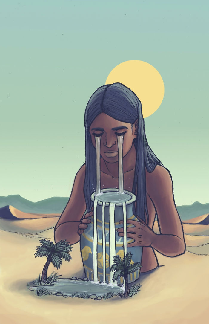
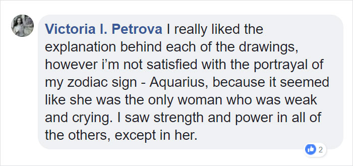
“Sagittarius might have been my favorite poster to illustrate, but this one was a very close second. I was determined not to do three ocean-themed posters in a row, so I put this sign in the desert and tried to make it feel like a creation myth. I really wanted to evoke the thought of Egyptian gods and giant Egyptian monuments.”
Pisces
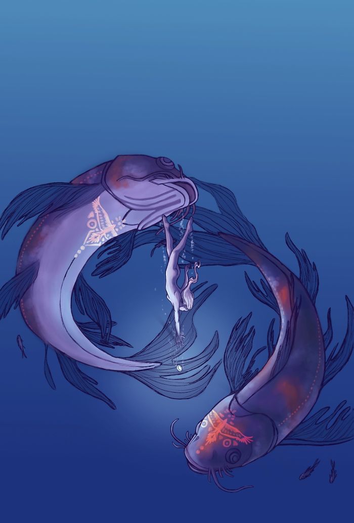
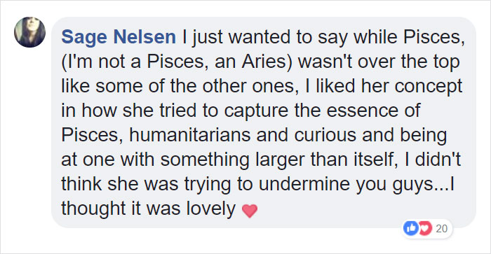
“In a few of the other posters I played with size and perspective to make the female figures feel more powerful and ethereal. For this poster, I wanted the female figure to feel dwarfed by the fish, giving her the sense of being much more human than some of the other signs and making the fish seem kind of reminiscent of ancient deep sea monsters.”





![Forest Essentials [CPV] WW](https://s3-us-west-2.amazonaws.com/pcw-uploads/logos/forest-essentials-promo-codes-coupons.png)
0 comments